Textbook Reference: Section 6.1 Graphs of the Sine and Cosine Functions
When you're getting to know someone, it's worth it to learn different things about them. You might know someone's favorite pizza topping or what kind of movies they like, but once you start talking about things like their family or where they grew up, you start to get a better understanding of who they are, and your friendship gets stronger.
...wait, what does this have to do with math?
Well, for the past few lessons, we've been primarily focusing on the geometric properties of the circular functions — the way that they tell us things like height, overness, and slope of an angle on the unit circle. These are great intuitions to have, but they're really only part of their story — we need to get to know them better. For the next few lessons, we'll be focusing on how they behave as functions in their own right — much like how you studied functions like polynomials and logarithms.
Getting a better picture
One of the best ways to really get to know a function is to look at its graph. They do say, after all, that a picture is worth a thousand words.
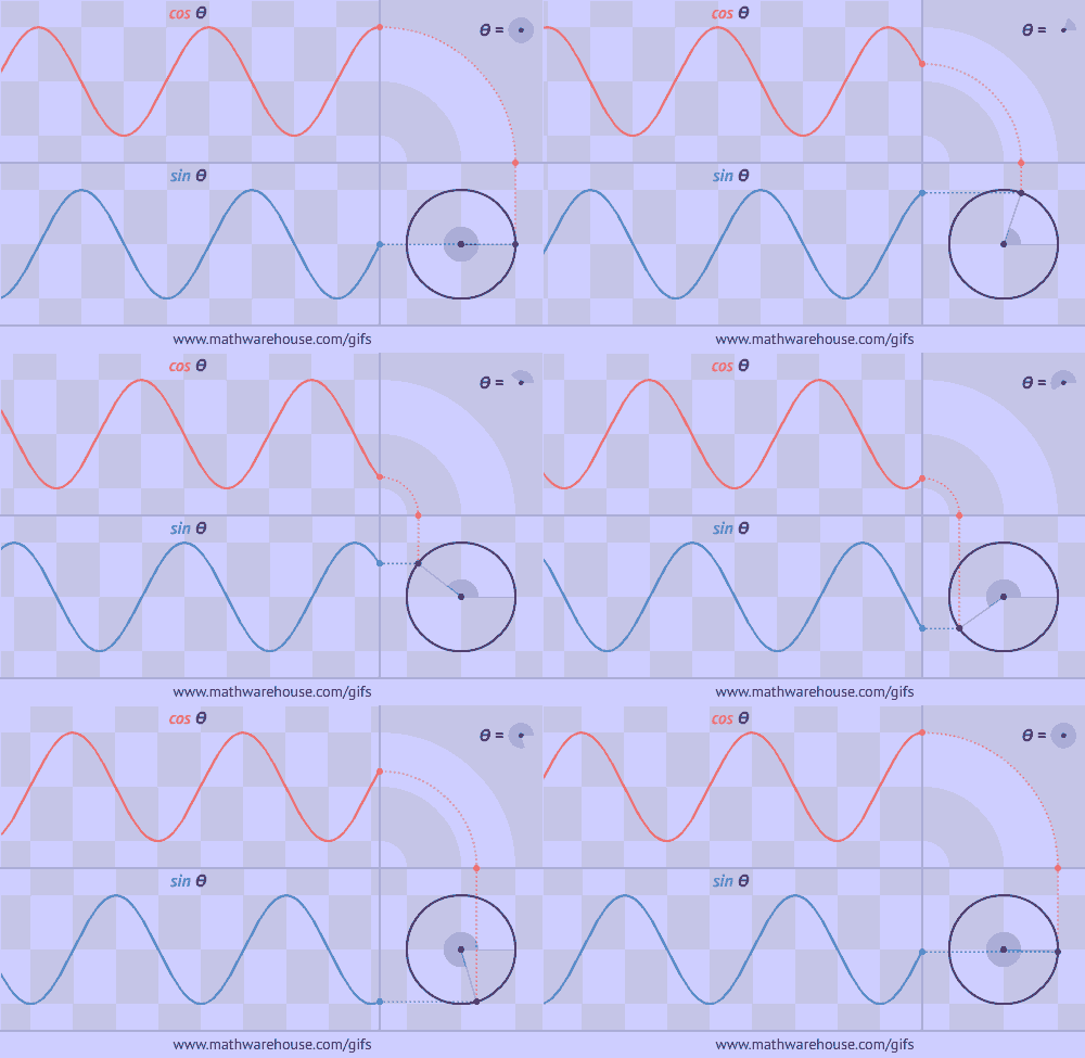
If that's the case, then a GIF is worth a thousand pictures:
As our point moves around the circle, its height and overness fluctuate, back and forth between \(-1\) and \(1\). The graph we get as a result is shaped like a wave — a shape we call a sinusoid.
Here's a portion of the graph of \(\color{flatblue}y=\sin(x)\), plotted on the interval \(0\le x\le 2\pi\):
And then the same portion of the graph of \(\color{flatred}y=\cos(x)\), over the same interval:
Note that I said these are only a portion of the graph. The full graphs are more like this:
Notice how the basic shape of each (which is a little darker in the above graph) repeats forever in either direction. This is what we mean we say that the sine and cosine are periodic functions, and we call one full cycle a period.
By the way, did you notice that I wrote \(\color{flatblue}\sin(x)\) above instead of \(\color{flatblue}\sin(\theta)\)? What's up with that?
Once we recognize the sine as a function, we can use whatever variables we want. Our input might be the angle of a unit circle, so we might use \(\theta\). But it also might be the time that we've been on a Ferris wheel, so we might end up using something else like \(t\).
Remember the immortal words of Shakespeare:
"A variable by any other name would smell as sweet."
(Okay, maybe I paraphrased a bit.)
More about sinusoids
We really unlock the true potential of sinusoidal graphs when we transform them:
To understand what we're seeing, it's helpful to define a few important terms:
- The midline is the horizontal line in the center of the wave, halfway between the maximum and the minimum height.
- The amplitude is the distance from the midline to either the maximum or the minimum; in other words, it's the maximum displacement from the midline.
- Amplitude is always given as a positive number.
- The period, as mentioned before, is how the length of one full cycle of the wave.

Click the picture to enlarge it.
For example, look at the following graph:
- The midline is the line \(y=1\).
- The amplitude is \(3\).
- The period is \(4\).
In class you'll explore how to produce a sinusoidal wave with any midline, amplitude, and period you'd like — which will be essential to using these waves in all sorts of applications!
Preview Activity 5
Answer these questions and submit your answers as a document on Moodle. (Please submit as .docx or .pdf if possible.)
- Complete the following table for \(\color{flatblue}y=\sin(x)\):
\(x\) \(0\) \(\tfrac\pi2\) \(\pi\) \(\tfrac{3\pi}2\) \(2\pi\) \(\color{flatblue}\sin(x)\)
Then sketch a graph of \(\color{flatblue}y=\sin(x)\) on the interval \([0,2\pi)\) as accurately as possible by hand, including these five points. - Repeat the above exercise for \(\color{flatred}y=\cos(x)\). Then compare and contrast the two graphs.
- By the way, you should practice sketching the graphs of \(\color{flatblue}y=\sin(x)\) and \(\color{flatred}y=\cos(x)\) from memory a few times. It really helps to be familiar with the basic shapes of these two functions!
- Refer back to the graphs of \(\color{flatblue}y=\sin(x)\) and \(\color{flatred}y=\cos(x)\).
- What is the midline of each of these graphs?
- What is the amplitude?
- What is the period?
- Explain in your own words why it should make sense that the sine and cosine functions are periodic — that is, why their graphs repeat forever. (It might help to remember what they represent on the unit circle!)
-
Answer AT LEAST one of the following questions:
- What was something you found interesting about this reading?
- What was an "a-ha" moment you had while doing this reading?
- What was the muddiest point of this reading for you?
- What question(s) do you have about anything you've read?


No comments :
Post a Comment